If not, it’s about time that you do. Here’s a good list of sites and dashboards to let you see up to date information about the spread of COVID-19:
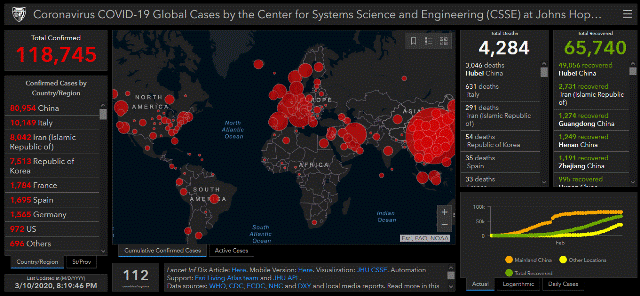
Johns Hopkins CSSE Map
The Johns Hopkins Center for Systems Science and Engineering (CSSE) Map is one of the best, most comprehensive dashboards available. Link here.
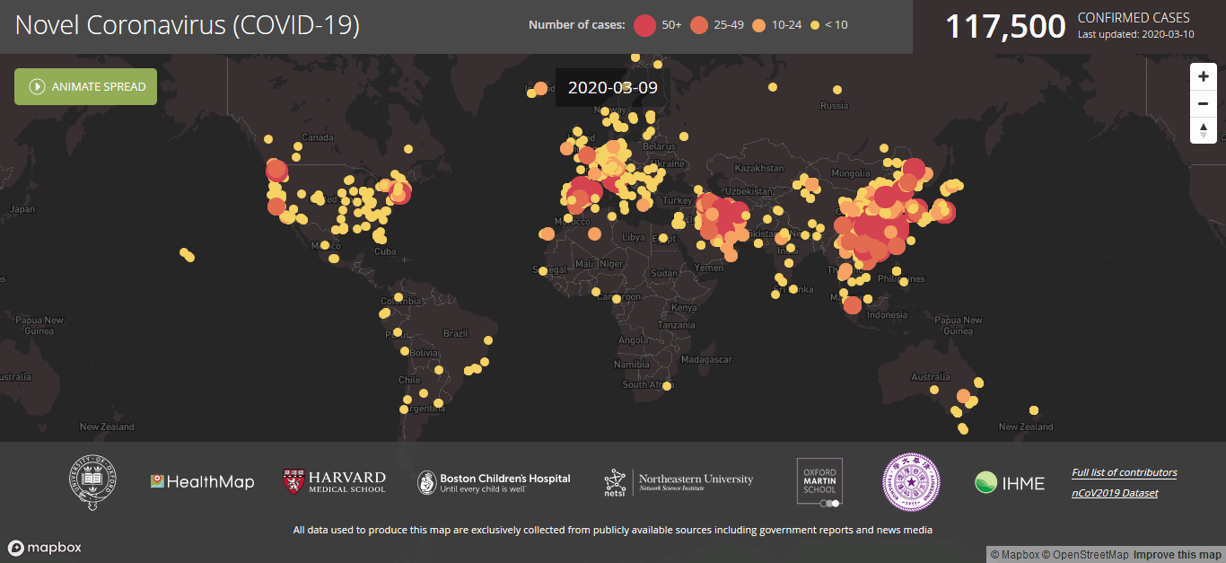
Healthmap
Another great dashboard, where you can actually animate the spread of the virus over time. Check out the United States in the last week! Link here.
Nextstrain
Want to get really technical? This site maps the genomic epidemiology of the virus, and also animates the spread by linking the transmissions.
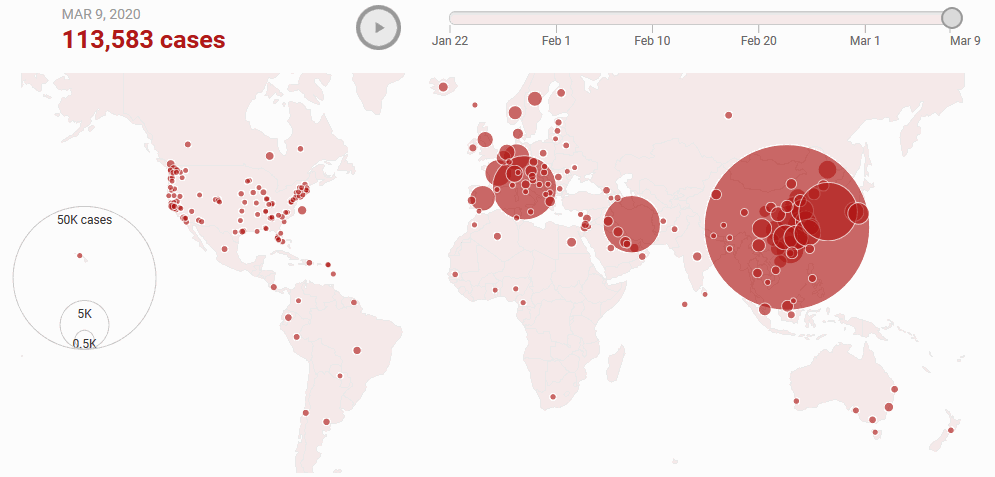
NBCNewYork
Here’s another great site that animates the spread of the virus.
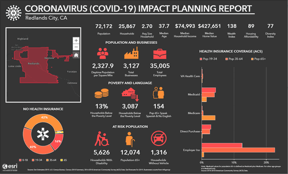
Esri's Coronavirus Infographic Template
Esri has created a template using Business Analyst that organizations can leverage to analyze how the Coronavirus is affecting different demographic groups.
Do you know of other good resources? Let us know in the comments!!


